What government and nonprofit websites often get wrong — and how to get it right
In public service, trust is everything. But too often, that trust is undermined by websites and digital platforms that confuse or frustrate users. Imagine: A pensioner in a small town is trying to apply for heating assistance as winter approaches. She finds the government website, but the application link is buried three pages deep under a department name she’s never heard of. The instructions are full of acronyms she doesn’t understand, and the form is only available as a PDF. It won’t even open on her mobile phone. Frustrated, she gives up.
From buried services to inaccessible layouts and outdated content, many government and nonprofit websites are harder to use and less relevant than they should be — especially for the people who rely on them most.
The good news? Most of these issues are fixable. Building trust online doesn’t require flashy features. It starts with rethinking how you communicate: clearly, accessibly, and with your users’ needs at the centre.
At Veedoo, we work with mission-driven teams to design websites and digital tools that deliver on the promise of public service and provide the information they need. Here are five common mistakes we see — and how to fix them.

Mistake #1: Assuming Users Will Figure It Out
As the old saying goes, assuming makes an…well, you probably know the rest. Too many websites are designed around assumptions: that users understand how to navigate, know the right terminology, or will take time to explore.
In reality, people come to your site with a purpose and limited patience. Did you know that more than 60% of users say they will leave a website if they can’t find what they want within five seconds? Be sure you are making the most of their time!
Fix it: Prioritise clarity. Make key actions obvious: "Apply for a service," "Get help," "Report an issue." Use plain language. Test your homepage and navigation with real users or stakeholders. If it takes more than a few seconds to find what they need, it’s time to simplify.

Mistake #2: Organising Content Around Internal Structure
Your users don’t care which department owns a page. They care about solving a problem, understanding a policy, accessing a service, or reading an article they’re looking for. But many websites mirror internal silos rather than the way people think.
Fix it: Structure your site around user journeys, not org charts. Group services by life event or need: "Starting a business," "Finding housing support," "Getting mental health help." Good content strategy starts with your audience’s priorities, not hierarchy.

Mistake #3: Neglecting Mobile and Low-Bandwidth Users
Public service websites must work for everyone, including people on mobile devices, limited data plans, or older phones. Yet many sites still prioritise desktop experiences, with large files, image-heavy layouts, and slow load times.
Fix it: Design for mobile first. Test your site on real devices and slower networks. Use responsive layouts, optimise images, and limit unnecessary scripts or pop-ups. Accessibility means accessible on all devices.
Mistake #4: Skipping Accessibility Basics
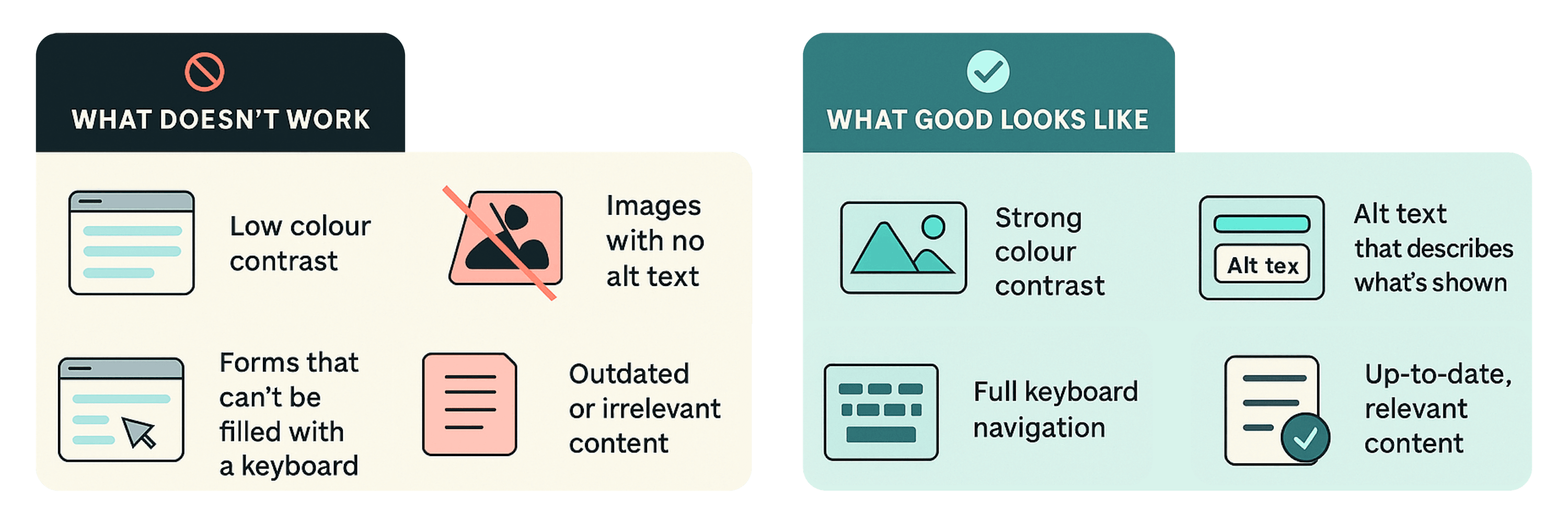
Does your digital platform speak to everyone? There’s no excuse for websites that can’t be used by people with disabilities. However, too many still lack keyboard navigation, alt text, readable contrast, or logical content order.
Fix it: Follow WCAG 2.1 standards. Use tools to test contrast and screen reader compatibility. Ensure every image has alt text. Accessibility isn’t just a compliance checkbox — it’s foundational to digital inclusion and public trust.
Mistake #5: Treating Content Like an Archive, Not a Service
This is the big one. Many sites overwhelm users with long paragraphs, out-of-date information, PDFs with no summaries, or dozens of undifferentiated links. This erodes trust and sends users elsewhere.
Fix it: Content is not decoration. It’s the service. Every page should have a clear purpose and a primary audience. Use headings to guide the reader, bullets for actions, and plain language for clarity.
Just as important, content must be kept fresh and relevant. A site that’s regularly updated signals credibility, responsiveness, and care for your users. Stale news, broken links, and outdated pages send a different message — that the organisation is inattentive or inactive.
Set up workflows for content review and maintenance. Assign content owners. Use analytics to understand what pages matter most. Archive what’s no longer needed and elevate what users return to again and again.
Accessibility Basics That Build Trust
Accessibility isn’t a checkbox — it’s how users experience your values.

Trust Is Built by Experiencing Your Values Online
Trust online isn’t built through mission statements. It’s built when someone finds what they need, quickly and easily. Public-facing websites should reflect public service values: clarity, inclusion, and reliability. This starts with content that’s easy to understand, accessible to all, and actively maintained.
At Veedoo, we help mission-driven teams design for trust through multilingual platforms, accessible interfaces, and user-centred communications. Because digital trust isn’t just a design goal. It’s a public good.


